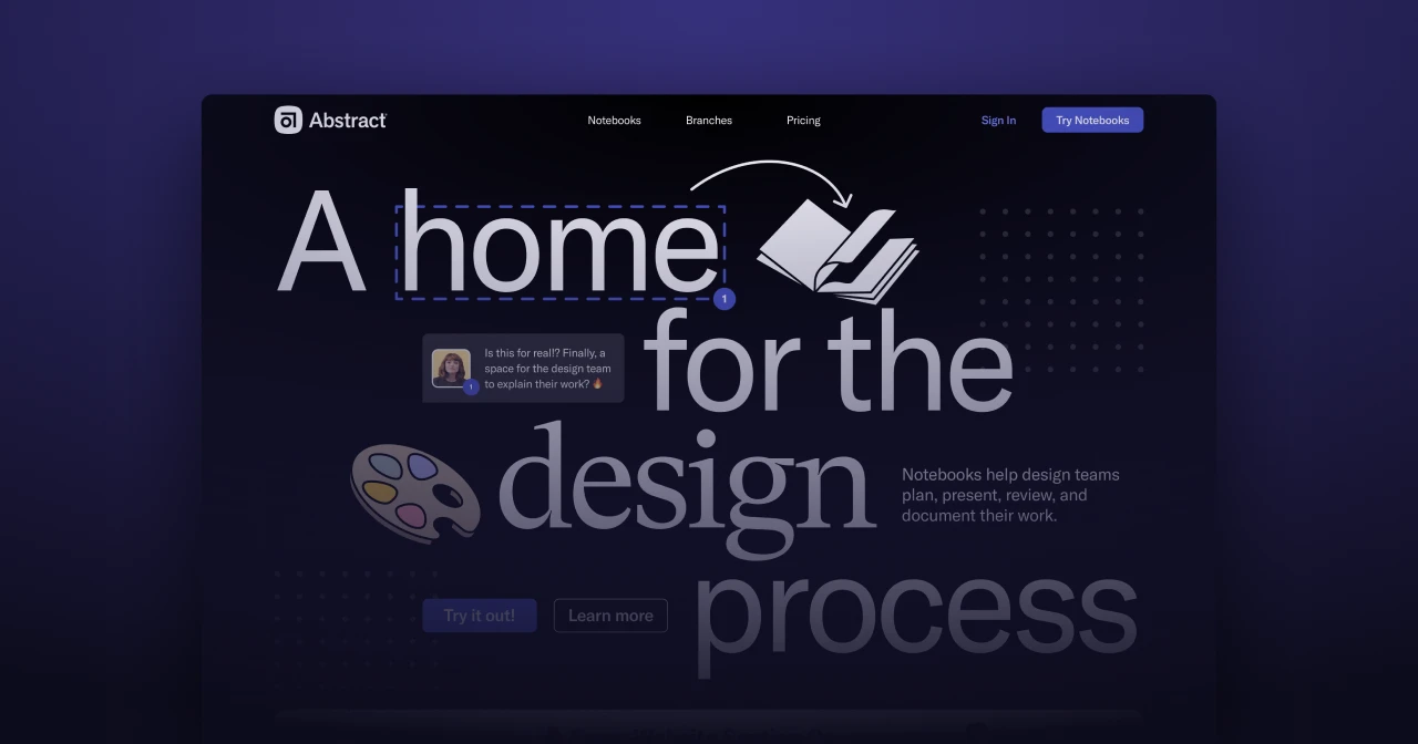
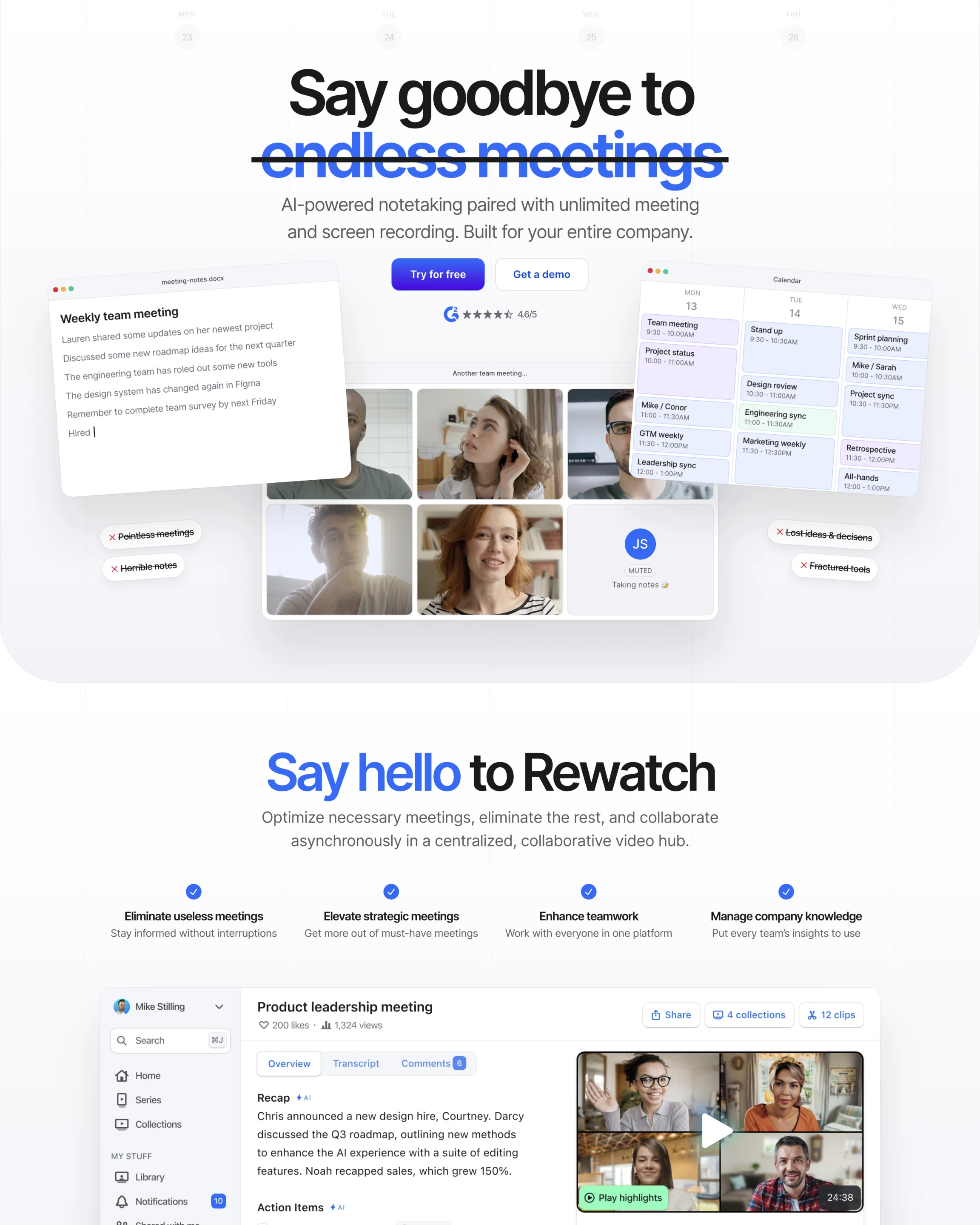
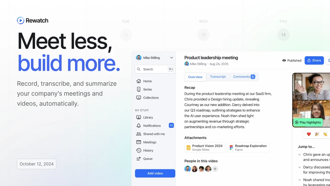
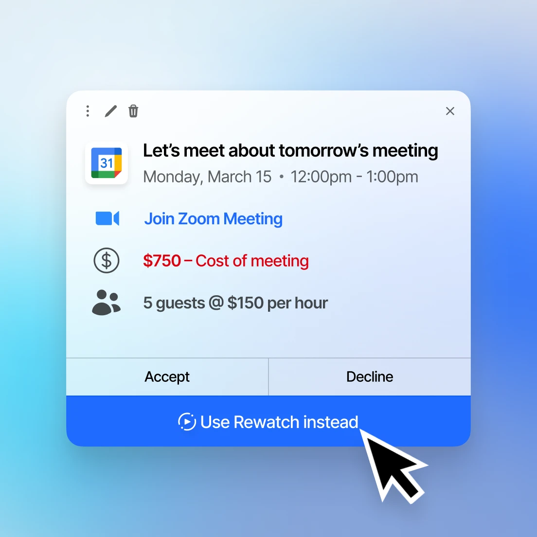
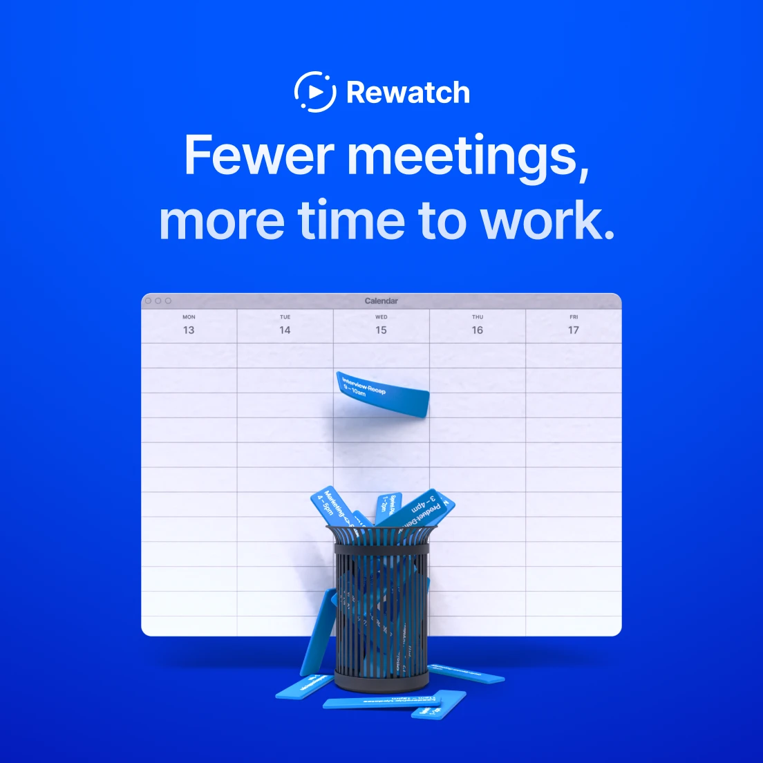
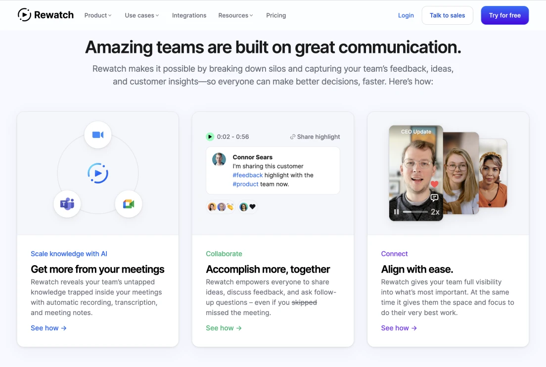
Meet less. Build more.
Rewatch saves, summarizes, and shares your company's meetings and screen recordings in a collaborative format.
While moving from product to sales-led growth strategies and back again, with a fluctuating customer profile, and an ever-changing product — Mike was responsibile for finding ways to drive revenue through marketing, brand, and web design at Rewatch.
As the sole designer focused on marketing, this meant Mike had to balance efficiency and quality, while prioritizing impact.
on Efficiency
Rewatch generally has around ~20 employees and targets medium to enterprise sized businesses—making it important to swing-up and look more reliable and established.
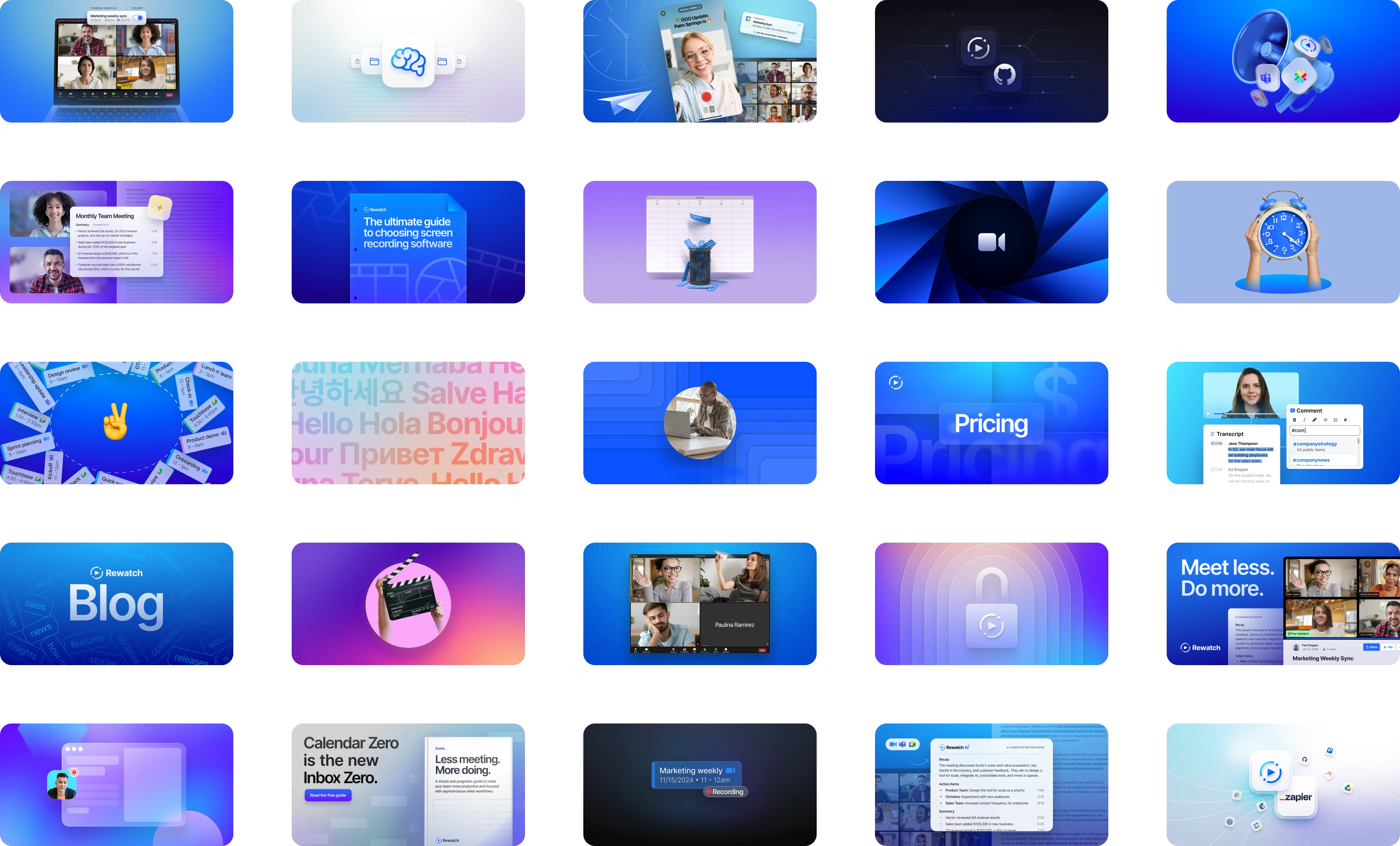
Mike’s technical background and familiarity with just about every design tool, made it possible to build a lot, fast, so that Rewatch could look as such and compete with larger competitors.
The challenge was shaping the brand in a way that allowed assets to be designed quickly, while still looking great, and being flexible enough to change with the business.
Building fast
At any given moment, “good” SaaS branding is fairly predictable. Strapped on time and striving for growth, reinventing this wasn’t feasible or conducive to the business goals. Instead, Mike opted to borrow and build upon bits and pieces of what currently works for industry leading teams targetting a similar audience.
Rewatch’s CEO is a fantastic product designer. Running with pieces of his previous work toward the brand also helped shape aspects of what it is today. On the marketing side, feedback centered around making the brand more approachable than it’s initial state of being dark and developer focused. Outside of that, most of the team’s early feedback was like, “we like Apple…” 😅
Mike reached for what was quickly achievable and balanced between the different stakeholders: clean typography and lots of white space. By removing the “dark mode” first approach to the brand, everything felt a bit friendlier and easier to digest.
For the final touches, Mike looked toward the product for direction. Thankfully, Rewatch’s product design team is top notch (shoutout to Conor Muirhead, who was also Mike’s manager). To increase uniformity, the primary color, grayscale, button stylings, and font-family were pulled from the product.
Under the hood
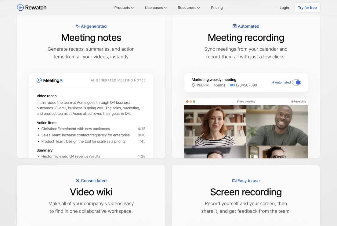
Mike also designed, built, and managed Rewatch’s marketing website. He chose tools that made building quick and flexible, while straightforward enough for the product folks to dive into, if help was ever needed.
To accomplish this, he used Eleventy as an SSG, with Nunjucks for templating, and UniformCSS as a utility framework; resulting in markup that was nearly identical to the product’s front-end. This enabled collaboration from the product team along with the ability to design in code — which saves the team a lot of time during the page creation process.
<!-- Website: 24px paragraph tag that's blue -->
<p class="font:2xl color:blue-md">
    No light/dark mode = more color variations.
</p>
<!-- Product: 24px paragraph tag that's blue -->
<p class="font:2xl color:blue">
    The web app used CSS variables for color theming.
</p>
Since CMS’s often promote over-templatization, Mike and the team opted to only rollout CMS functionality in places where it was absolutely needed, such as the blog and changelog. Mike used Netlify CMS (now Decap), as a minimalist solution. Being Git-based and writing to markdown, this CMS fit well with the existing content format too.
on Quality
Moving extremely fast with limited resources will lead to sloppiness. It’s inevitable. At some point, there will be work that is not as great as it could be. At Rewatch, Mike tried to minimize this by taking a thoughtful approach to visual direction.
Relying on ample whitespace, consistent color, and bold typography allowed Mike to work more efficiently within his wheelhouse, reducing the amount of time he spent in processes that he’s less skilled at, such as vector illustration. This kept asset creation fast and the quality of those assets stronger.
increasing Performance
Conveying SaaS concepts in a purely iconified or visual way, without text, is nearly impossible. Due to that, messaging plays a pivotal role within design for SaaS companies and is largely responsible for the performance and result of design outputs.
At Rewatch, messaging has bounced between benefit and feature-based approaches. The main cause of the switching was due to shifts in the ICP that Rewatch was targetting.
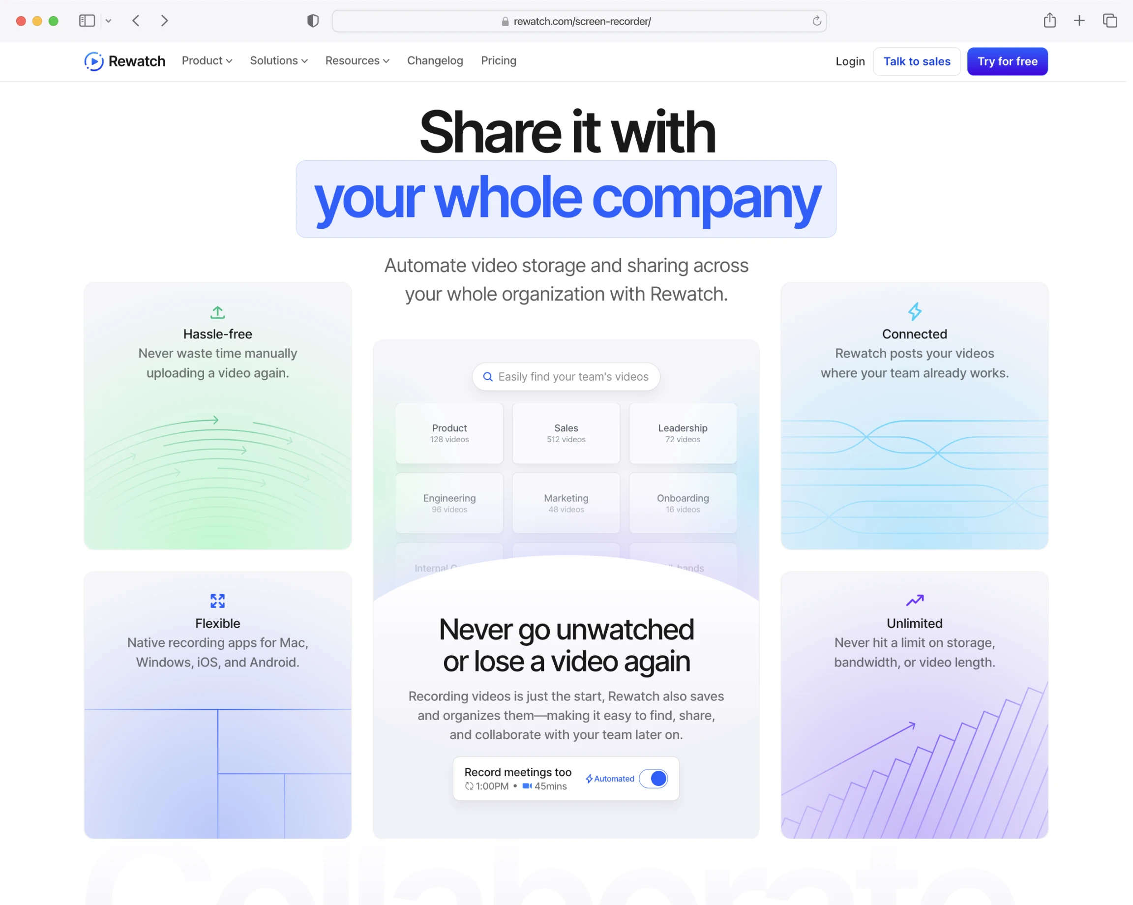
for your entire company
your entire company
It was assumed that enterprise buyers preferred benefits, but Rewatch’s benefits provide limited insight into functionality —resulting in grandiose promises from an unfamiliar company with little explanation of how those promises would be fulfilled.
More or less, when only using benefits, people had a hard time understanding what the product actually did.
While at first, going between the two was a matter of preference and opinion, leveraging analytics, Mike uncovered that feature-based messaging was more effective. Pages using concise, feature-based copy converted at a significantly higher rate than those heavily relying on benefit-based jargon.
Although, benefits still had a time and place. Working in unison with Darcy, the demand-gen manager, they found benefit-based headlines that were relatable performed better on social channels as a means to capture initial interest.
On the marketing site, this lead to the approach of capturing interest with a relatable benefit as a headline, then clarified immediately with “how” that benefit will be delivered via features in the subhead and following supporting sections.
Prioritizing impact
How we spend our time is always a tradeoff. To actively focus on “X” means not focusing on “Y” — and, when there’s an endless pile of work in front of us, it’s easy to lose sight of this.
To add to this pile, most mainstream marketing practices, such as content and/or account-based marketing, promote quantity over quality. Rewatch did both — seemingly almost every B2B SaaS company does.
Due to this widespread adoption, Mike believes many teams are just going through the motions; not considering whether the content itself is meaningful or deeply analyzing performance to clarify these tactics actually work and warrant our time.
Shifting focus
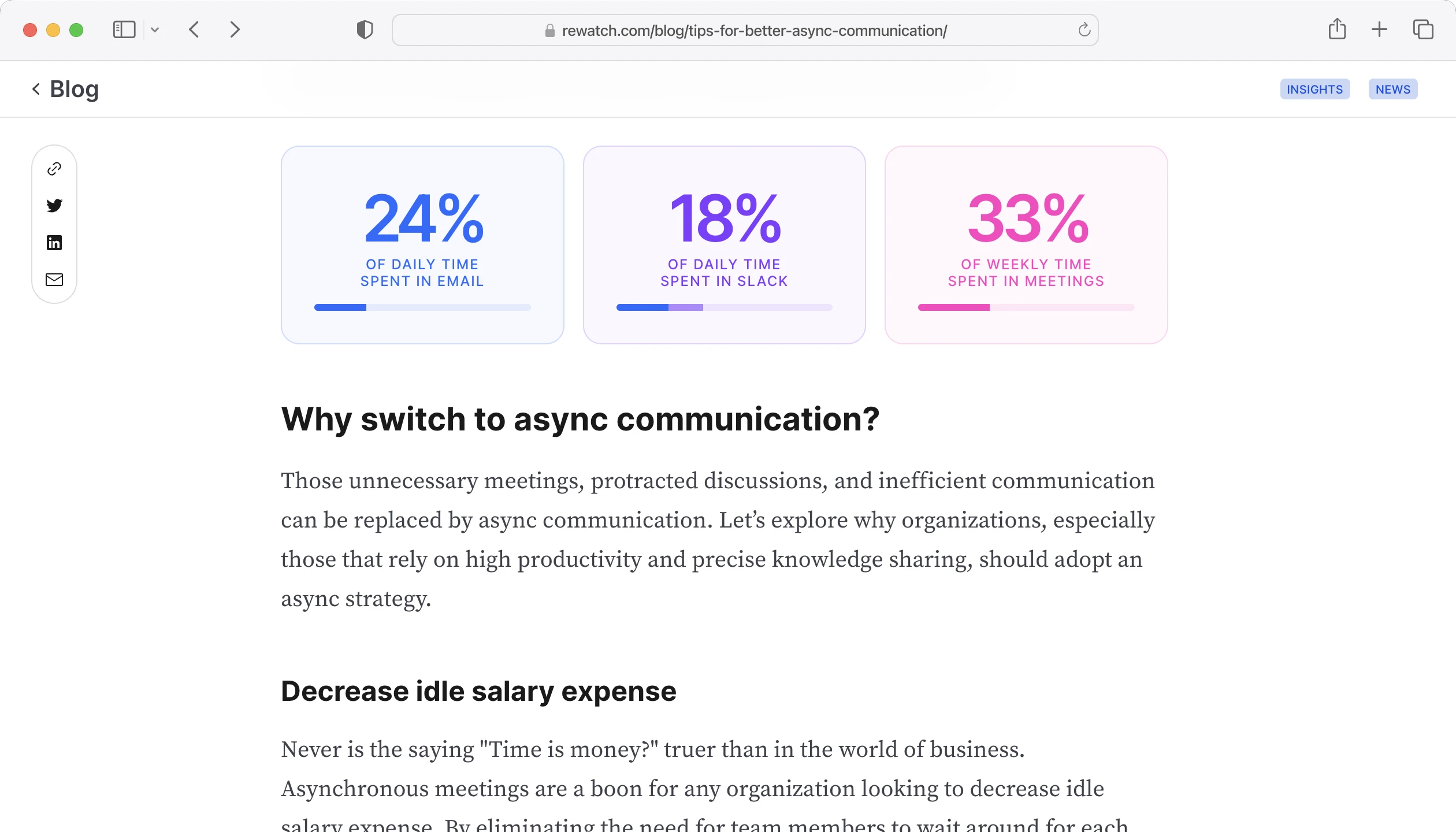
At Rewatch, Mike had spent ~50% of his time creating assets for content marketing lead by the marketing team. Continually, the results of this tactic had been abysmal. For reference, like: 150 impressions per average social post, engagement only coming from internal employees, <10 clicks leading to page views per month, and almost never a conversion…
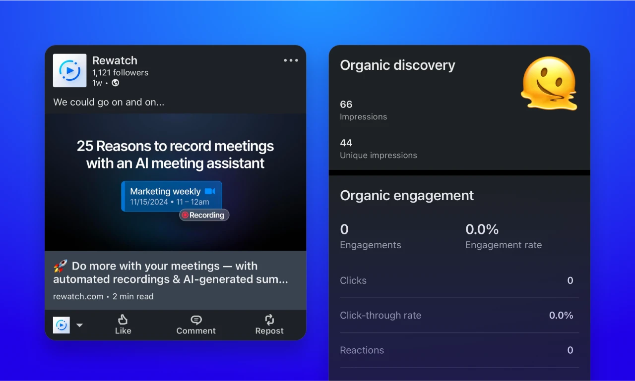
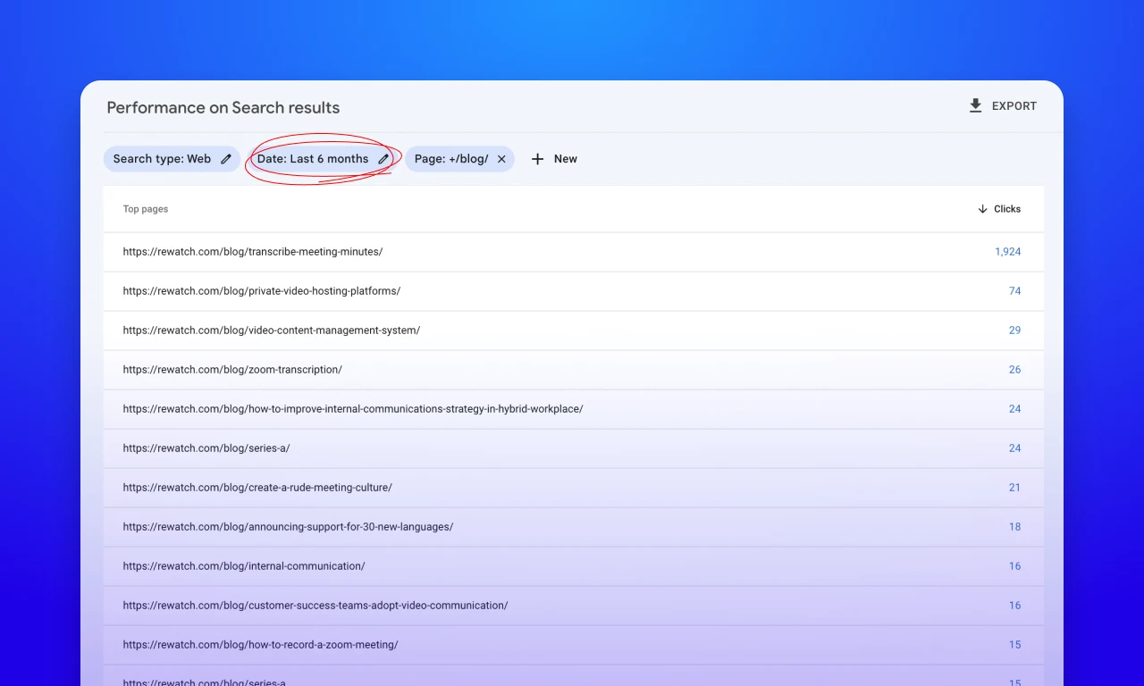
Rewatch’s content wasn’t increasing SEO performance either. Over six months, only one blog post had over >100 clicks.
This lack of result was frustrating and inspired Mike to start questioning the value in a lot of the work being asked of him.
Is this really the best use of my time?
In search of more fulfilling work that drove results, Mike dug back into analytics. Over 30 days, Rewatch’s home page was getting ~6.5x more traffic than every blog post combined. With that, a couple of key product pages were getting around the same amount of traffic as every post combined.
These large, foundational pages hadn’t been touched in a while and the conversion rate on them wasn’t where it should be. (re-enter benefit vs. feature-based messaging)
At this point, Mike began advocating that the team allocate time toward refining these pages. Again, Mike used to site analytics and the results of specific, feature-based messaging to get buy-in from and communicate value to the rest of the team.
At Rewatch, homepage edits are a touchy subject. To get around this, Mike also built out a quick design spike to visualize just how much clearer this page could be with some simple visual and messaging updates.
Key Takeaways
Throughout Mike’s ~2 years at Rewatch, he has grown a lot. A few of the main takeaways from his time there are:
First, nail the basics
Whether it’s design, dev, or marketing — the fundamental aspects of anything are what matter most. Make sure they work before building on top of them.
Simple works
At one point, Mike tried building out 3D UI mocks like Microsoft Fluent uses… It was a lot, and a total flop. He reverted to regular 1:1 UI mocks and they looked just as good. In summary, simple doesn’t mean boring or ugly. Usually it’s easier to execute well and understand anyway.
Marketing is part of the job
Just like designers get ideas and feedback from their friends in marketing, marketers should be getting ideas and feedback from folks in design. As creators, we have the unique ability to build ideas outside of a word doc, take advantage of that.