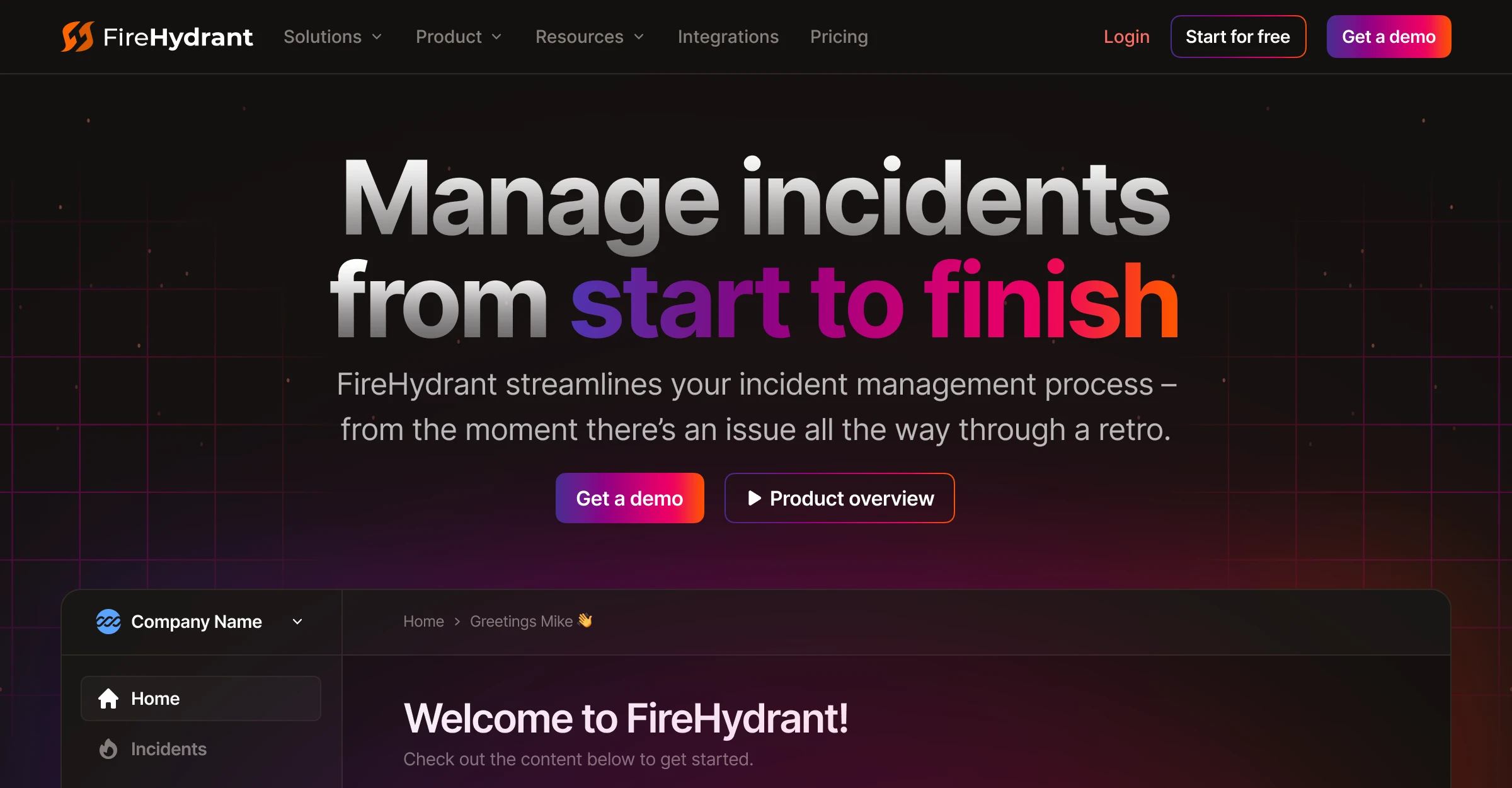
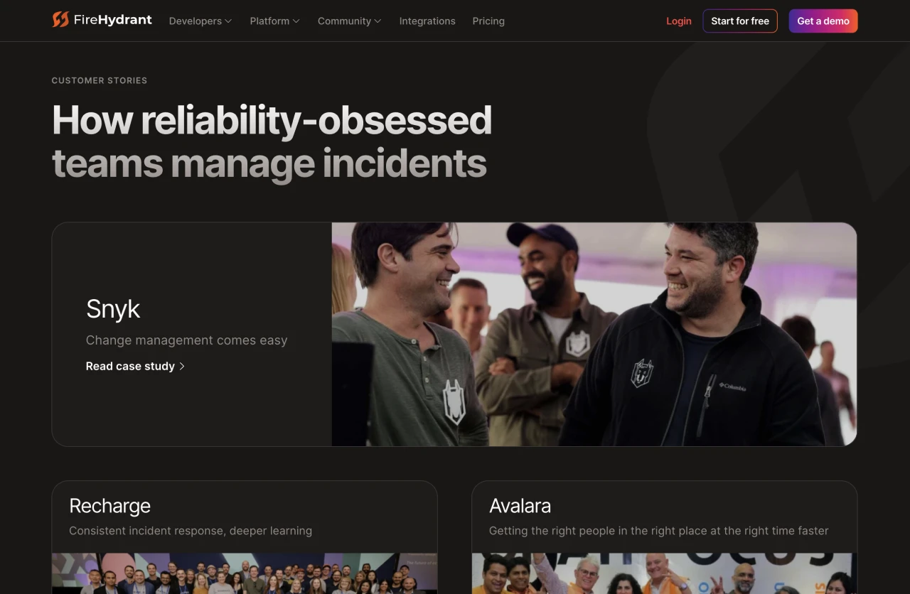
Incident Management
FireHydrant helps engineering teams automate, respond to, learn from, and improve upon their incidents.
When Mike joined FireHydrant’s recently formed marketing team, they were trying to supplement a slowing outbound sales pipeline by ramping up inbound leads. Mike was responsible for rapidly re/designing and re/building touchpoints that supported. this effort.
Within his first 30 days, Mike redesigned and rebuilt the entire marketing site and shipped a brand-new “data story” campaign. In his first 60, he helped launch an all new documentation site, and overhauled the FireHydrant visual identity.
To meet velocity required, Mike had to adapt fast - relying heavily on his past experience, both technical and otherwise, while collaborating effectively with a new, unfamiliar team.
on Adaptability
While interviewing with FireHydrant, the business outlook was fantastic… Almost immediately upon starting that had changed. So much so, that within Mike’s first month, there was a round of layoffs that impacted ~20% of the company.
With that came the need for action, fast. This left little to no time for onboarding; Mike was coding and shipping his first week.
To add to the stress, the existing marketing site was cobbled together by an external agency using a framework that Mike was unfamiliar with along with a complete mismatch of styles, and a dumpster fire of a CMS.
To recap, the brand was rough, the site was a mess, the team was new, the outlook was bleak, and time, non-existent. So naturally, Mike’s first suggestion at FireHydrant being to rebuild the entire marketing site initially sounded wild.
Rebuild and refine
Getting up to speed on the framework, detangling the CMS, and unifying the styling across the existing site would take longer than just rebuilding it from scratch. With that, the unfamiliarity would linger for months, adding time to future projects.
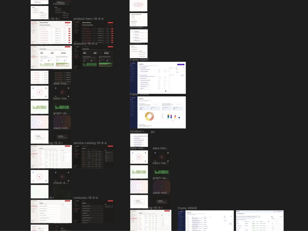
To qualm fears, Mike took a gamble and promised the rebuild to take three weeks or less. There was still some hesitation, so within his first week, Mike rebuilt the homepage overnight using his favorite tools.
This exercise helped communicate a few things. First, it provided a clear example of what the site could look like and that a massive jump/change in the brand itself wasn’t needed. Specifically, it ensured the brand could benefit from it’s existing recognition. Second, it built trust toward Mike being capable of delivering on his promise. Beyond that, it showed the code itself was easier to work on, maintain, and understand by the greater team.
The rebuild was approved and Mike got to work. He was able to deliver on his promise, and the new site was launched within three weeks improving uniformity, accessibility, performance, maintainability, and the overall brand.
-
>300+Pages updated across site in total
-
25+Custom page templates rebuilt
-
-50%Less dependencies in the codebase
-
+56%Increase in Lighthouse scores
on Technical Experience
The key to all of this progress in a short amount of time was Mike’s direct experience doing these exact tasks: designing and building brands, campaigns, and websites from scratch for lean SaaS companies targetting enterprise customers.
Remixing and rebuilding a site like this wasn’t a new experience. Mike had just finished doing this same thing, a couple of times, while at Rewatch. This gave him the foundation needed to move quickly without over-analyzing every micro decision.
For decisions like choosing an SSG or how to approach the CSS structure, or even something as complex as building out the navigation, Mike had a direct frame of reference. This excercise also gave Mike another opportunity to further refine those previous approaches to design and code along the way.
Informing design
Most SaaS products and brands that are achieving excellence through design today are simply doing a better job at embracing the tools used to build it. Understanding this doesn’t just lead to better quality, it also results in efficiency, collaboration, and, ultimately, revenue.
Whether it’s in Figma or the front-end, that means knowing how to make the box-model beautiful. In either case, the greatness of this model is its simplicity and reliance on design fundamentals.
Fortunately, Mike was schooled in traditional print design. This education gave him an appreciation for visual design intricacies like value, white space, and typography that are often forgotten but foundational in achieving success through the box-model.
Pairing the understanding of what “makes” a design unique with the ability to technically break those properties apart helps Mike comprehend how great design is being created and then remix it toward the current problem he’s trying to solve.
On the dev side, this understanding has helped Mike choose tools and approaches that cater to these design requirements. For example, tools that make experimenting with and altering a grayscale across an entire site simple to nail value and contrast, or fine tuning line-height and letter-spacing to achieve the amount of optimal white space, site-wide.
In regards to FireHydrant, this knowledge and approach helped Mike quickly build and arrive upon a strong visual direction to an engineering-focused brand that was scalable while maintaining enough similarity to the existing direction to maintain brand recongnition. So much so, that the team wanted to find how to align the product to it, ASAP.
on Collaboration
To enable collaboration is to open up processes, making them approachable and easy to understand — within reason, giving every team member the ability to express, build, and share their ideas in a format that progresses work vs. picks it apart.
At FireHydrant, a major hurdle in the site rebuild/redesign was the existing product UI. Honestly, it was just bad — so much so that using it within marketing assets felt like a deturrent for prospects weighing the tool against competitors.
Major hurdles
To get around ugly product UI, Mike decided to polish up a few key product screens on-the-fly and stub them into the new site —unintentionally sparking chaos and outrage 🙈.
The VP of Product Design was not happy. Unbeknown to Mike, and most of the company, they had been working on a redesign for the past six months. The examples Mike had put together were in direct conflict with that work and, to some extent, forced that hidden work to be seen by the greater team.
Adding to the awkwardness, once shown, the direction of the silo’d product redesign was not well received nor was there much progress for the amount of time that had been spent on it.
All of this was happening around Mike’s 15 day mark. To be fair, it was probably odd that a “web developer” working on marketing stuff was proposing product design. Looking back, gaining historical context and insight into what lead to the current state of the product would have been helpful. In any case, things got even weirder a week later when the VP of Product Design was let go during a round of layoffs…
At this point, the site rebuild was blocked by need for better looking, more aligned product UI. The remaining product design team was also relatively new — which left two unfamiliar teams in a fairly awkward situation that had to be solved rather quicky.
Removing silos
To get past the awkwardness and engage the other team, Mike visualized the problem in a way that resonated. He replaced the polished UI with 1:1 screenshots of the product. Simultaneously, Mike converted the pages that he designed in code to Figma so that the product design team could easily experiment with solutions that they too felt good about.
This approach worked. Most importantly, it familiarized the two teams while unlocking cross-functional collaboration. Beyond that, it expedited the project; allowing the product team to work on visuals while Mike continued with other aspects of the site.
Building for teams
Typically, Mike documents his work thoroughly work for a couple of reasons. First, the process of forcing oneself to present what they’re doing acts as a check on logic and reasoning. Secondly, by sharing that documentation, it enables others to understand and build upon the work while also reviewing it, preventing silos.
At FireHydrant, this paid of quickly. Using the documentation Mike put together for the marketing site, a sales engineers was able to build out an MVP for a new Product Docs site within a couple weeks — effectively removing a costly help-center tool from the stack and leveling up the quality of the Docs themself.
After syncing up on the project, Mike helped with some final touches on the design and then they shipped it.
Inspiring the organization
At the time, the rate at which the new marketing and docs sites were shipped along with the quality that was met, was a positive change of pace for FireHydrant. Seeing how these projects were built inspired the rest of the team.
Shortly after parting ways with FireHydrant, they shipped a new, fully redesigned product that was built within weeks 🚢.
Mike eventually boomeranged back to Rewatch, but was fortunate enough to continue working with this delightful team on an ongoing, contract basis.
Key Takeaways
While Mike’s time at FireHydrant was brief, it was impactful and loaded with new experiences that he learned from. Here are a few of the key takeaways:
Seeing is believing
It’s easier to get people to believe in, trust, and advocate for something that they can see and interact with, vs. something they can only read or hear about. Sometimes, building an example is a better first step than asking for permission.
Lead through action
Aside from leading and managing the company, Robert Ross, the Co-founder and CEO of FireHydrant, regularly pushes code, writes blog/social posts, and records videos to market the product. It was inspiring to work with and alongside him. Mike strives to lead in similar ways, demonstrating empathy and understanding through first-hand experience, doing the work.
Solutions > Problems
Focusing on how or why something is problematic is easier than finding a resolution to make it work within those constraints. Though, almost always, finding that solution is going to be more valuable and rewarding than basking in problems, even if the situation it was built within is less than ideal.